We research, design and test web and mobile interfaces that users understand and developers can build fast.















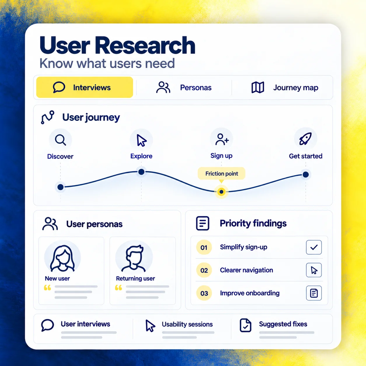
We interview your users, watch how they use your product and study your analytics to find where they get stuck. Every design decision after that has a reason behind it.
You get a short research report with user personas, journey maps and a ranked list of problems to fix. Your team agrees on who the product is for and what matters most.
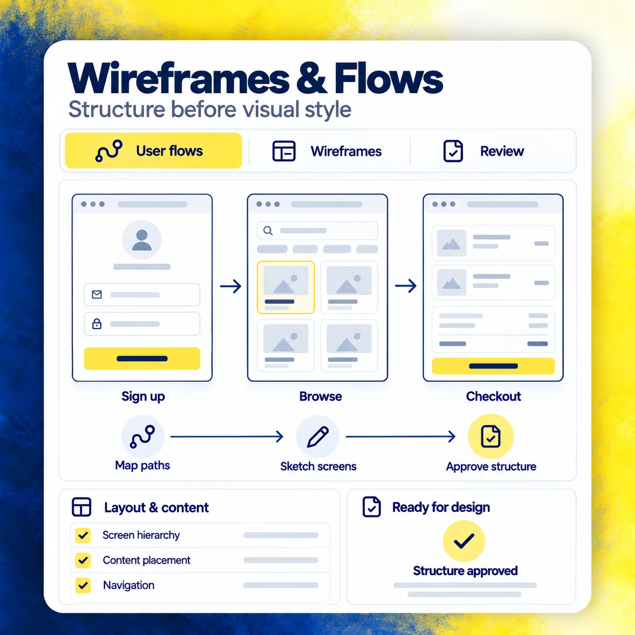
We map every path a user takes through your product, from sign-up to checkout, and sketch each screen as a simple wireframe. You approve the structure before any visual design starts.
Changing a wireframe takes minutes, while changing finished code takes weeks. Getting the layout and content right at this stage saves you time and budget later in the project.
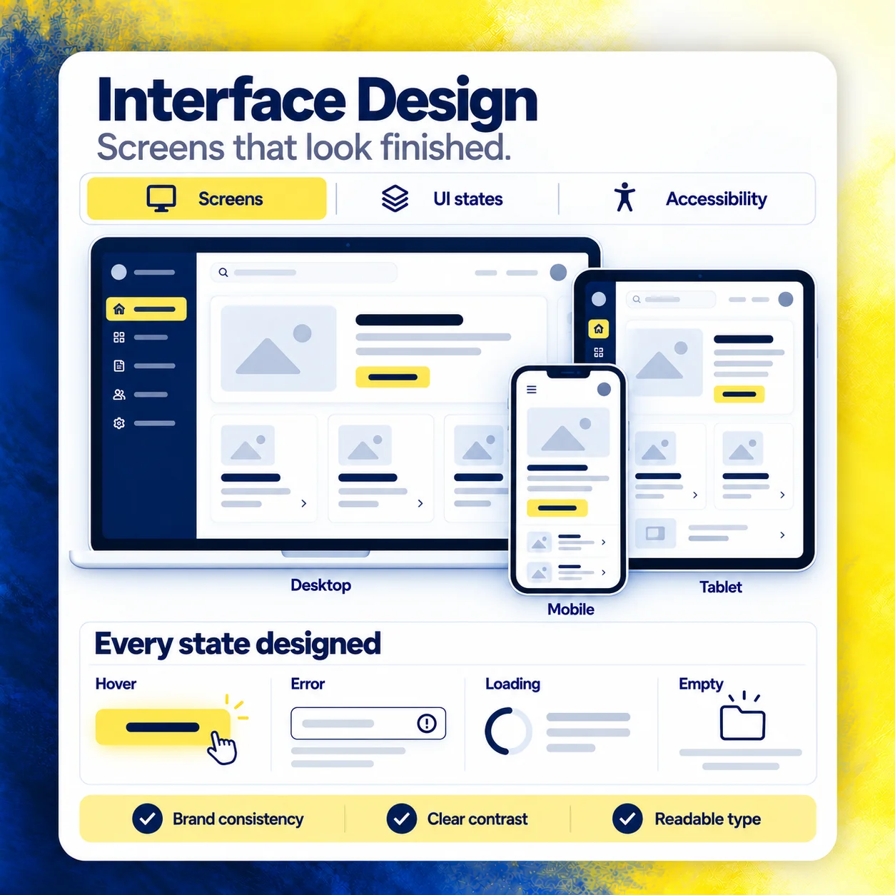
We turn approved wireframes into polished screens in Figma, using your brand colors, typography and imagery. Every screen comes in desktop, tablet and mobile sizes, ready for review.
We design hover, error, loading and empty states for every element, so developers never have to guess how something should behave. We also check color contrast and text size against accessibility standards.
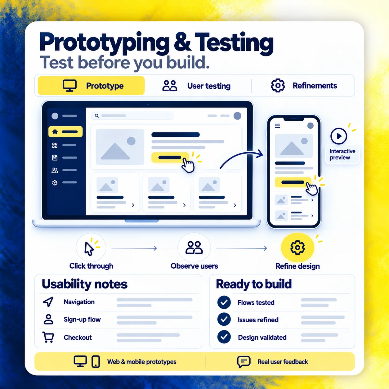
We link your screens into a clickable prototype that feels like the real product on a phone or laptop. Founders use it to pitch investors and test ideas with customers.
We run usability tests with five to eight real users, record where they hesitate and fix the problems straight away. You start development knowing the design already works for people.
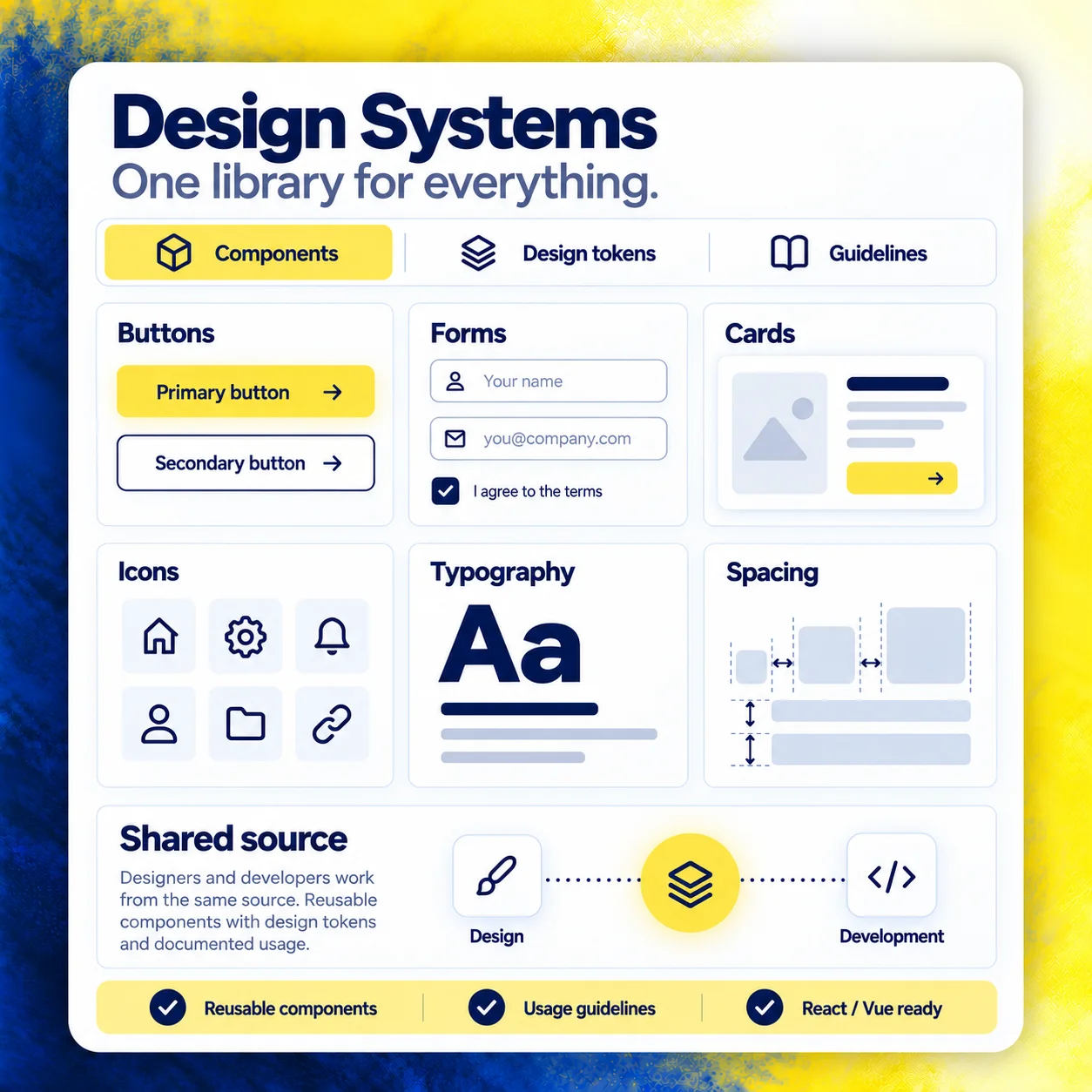
We build a shared library of buttons, forms, cards, icons and layouts, each with clear rules for spacing, color and type. Your designers and developers work from the same source.
New pages take hours to design instead of days, and the product looks the same everywhere as it grows. We document every component, so new team members can use it from week one.
Every file comes with measurements, spacing, assets and component notes, so developers build exactly what was designed. You own all the Figma files and can share them with any team.
Average lift in sign-ups or checkouts after clients launch the user flows we redesigned.
Products that go through our research and testing process see around 40% fewer support tickets from users who can't find what they need.
Your support team spends less time explaining the product, and more of your visitors turn into paying customers on their first visit.